the problem
NEA Member Benefits wanted to launch a self-advising retirement product.
A self-service retirement experience for NEA members that explains the options first and hands members to enrollment with confidence.
NEA Member Benefits wanted to launch a self-advising retirement product.
A self-service retirement experience for NEA members that explains the options first and hands members to enrollment with confidence.
Usability test success rose from 47% (tree test) to 87%.
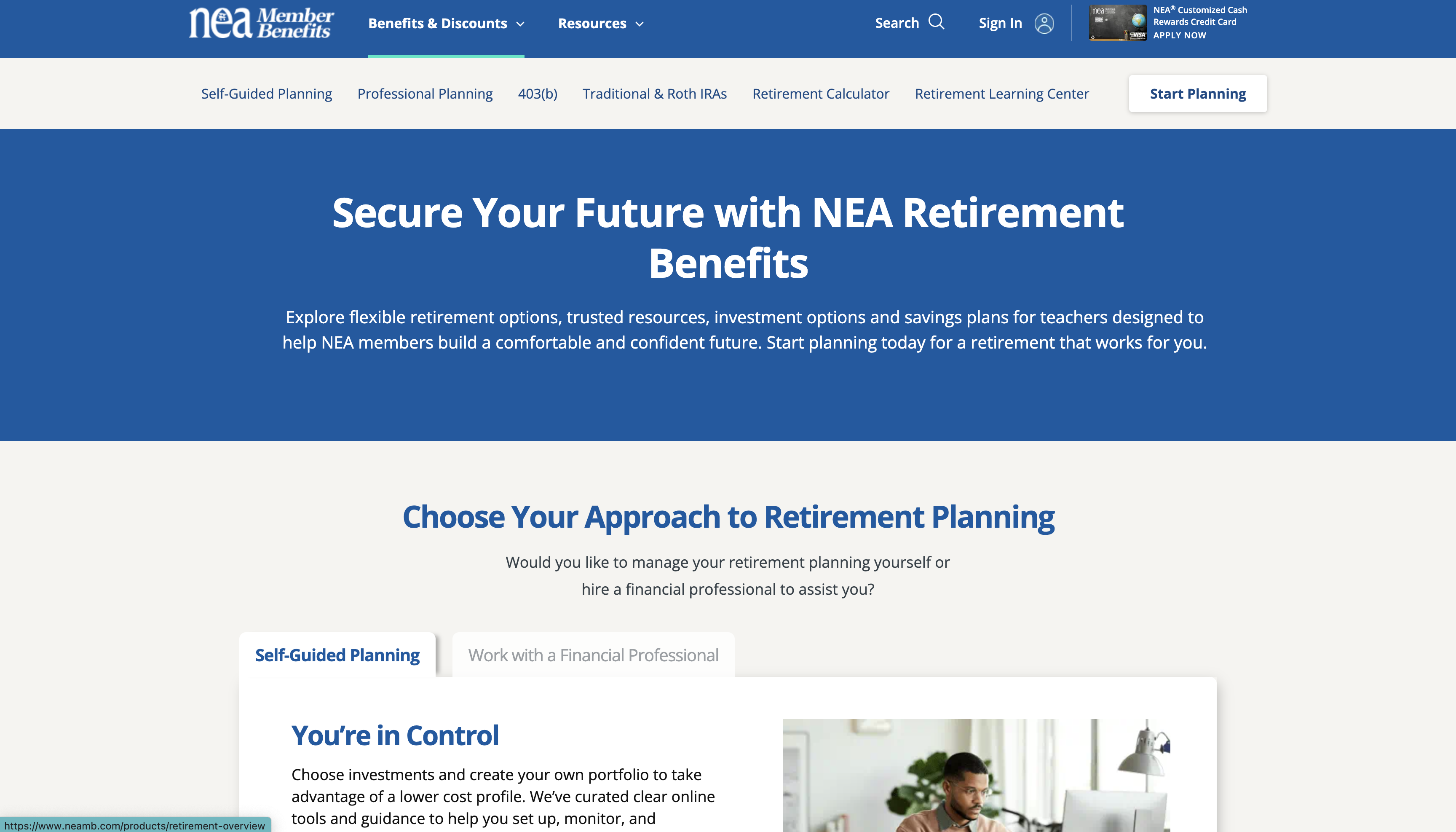
NEA Member Benefits wanted to launch a self-advising retirement product. 59% of members did not know the programs existed, even though 6 in 10 wanted to invest, and 80% of enrollments needed an agent. Enrolling was manual and involved the member, an advisor, the school district and its business manager.
The design also had to work for four stakeholders (NEAMB, the advisors, the provider Security Benefit and the members), fit an existing design system and site structure, and respect the legal rules of retirement products.
Grew the user journey into a service blueprint covering data hand-off to the provider, the advisor's role, and what to capture for later. Then I ran a priority workshop: the questionnaire, the calculator, and the move from NEAMB to the provider came first.
A tree test showed members could not find the new pages: only 47% completed the tasks. We renamed pages to match how members think and added local navigation, while keeping the global structure the client required. NEAMB used our recommendations in live A/B tests.
I pushed for usability tests on low-fi designs, in batches that followed the critical paths. Members completed 87% of tasks.
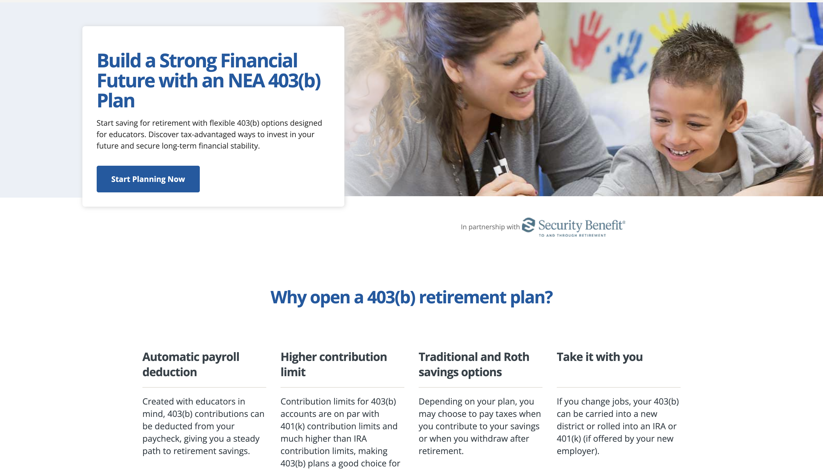
Interviews showed retirement was confusing, so education moved onto the NEAMB site, with the provider only handling the final enrollment step.
Progressive disclosure, mid-page calls to action and trust signals, a natural-language form to narrow choices, and a clear "you are leaving NEAMB" step that introduced the advisor who would follow up.
Usability test success rose from 47% (tree test) to 87%.
More members enrolled through self-service than through the old agent-led process.
Awareness of the retirement programs and engagement with the new tools went up.
Enrolling took members much less time and effort.
An enterprise pricing tool that gave NextEra Energy executives a clear view of project pricing, built to support $18 million in annual savings.
or see all 20 projects