what the ai did
Read the Figma file and the live site. Traced the drawings. Wrote the drawing engine, the design system, and the production code. Redrew things ten times without complaining once.
Not a prompt and a miracle. A long conversation with Claude Code, a lot of critique, and a rule about pen pressure that fixed everything.
Read the Figma file and the live site. Traced the drawings. Wrote the drawing engine, the design system, and the production code. Redrew things ten times without complaining once.
Every drawing it started from. Every direction call. Every critique, and there were many. The taste, the standard, and the decision about when something was finished.
Claude read the live Webflow site and pulled it apart: every colour variable, the type ramp, every component measurement, and which parts were the template versus actually mine.

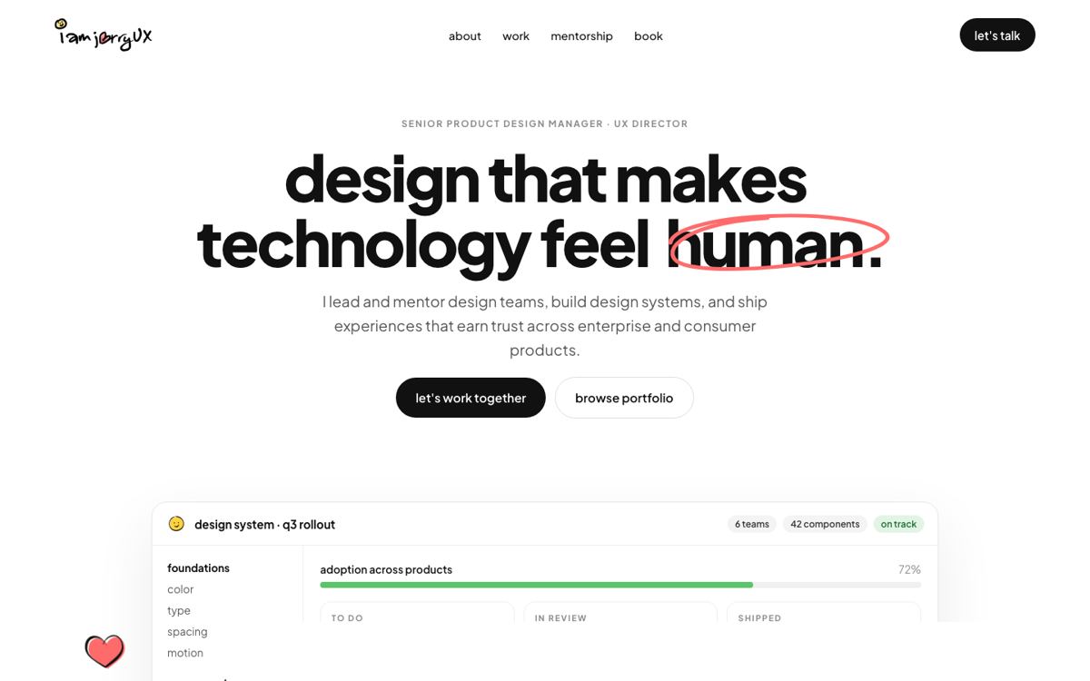
Four full homepage directions, side by side on a shared canvas, so the decision was visual, not verbal. None of them were right, and that was the useful part.

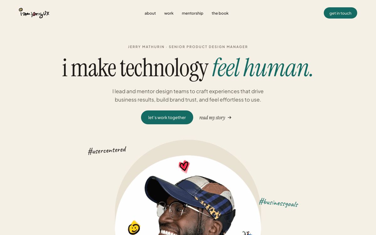
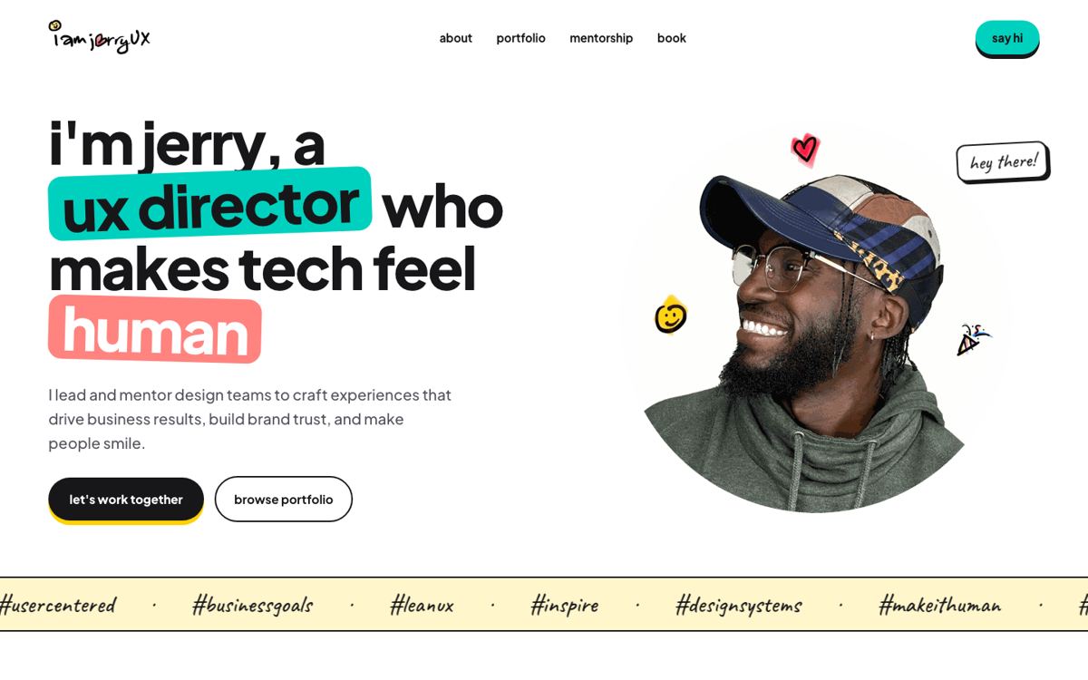
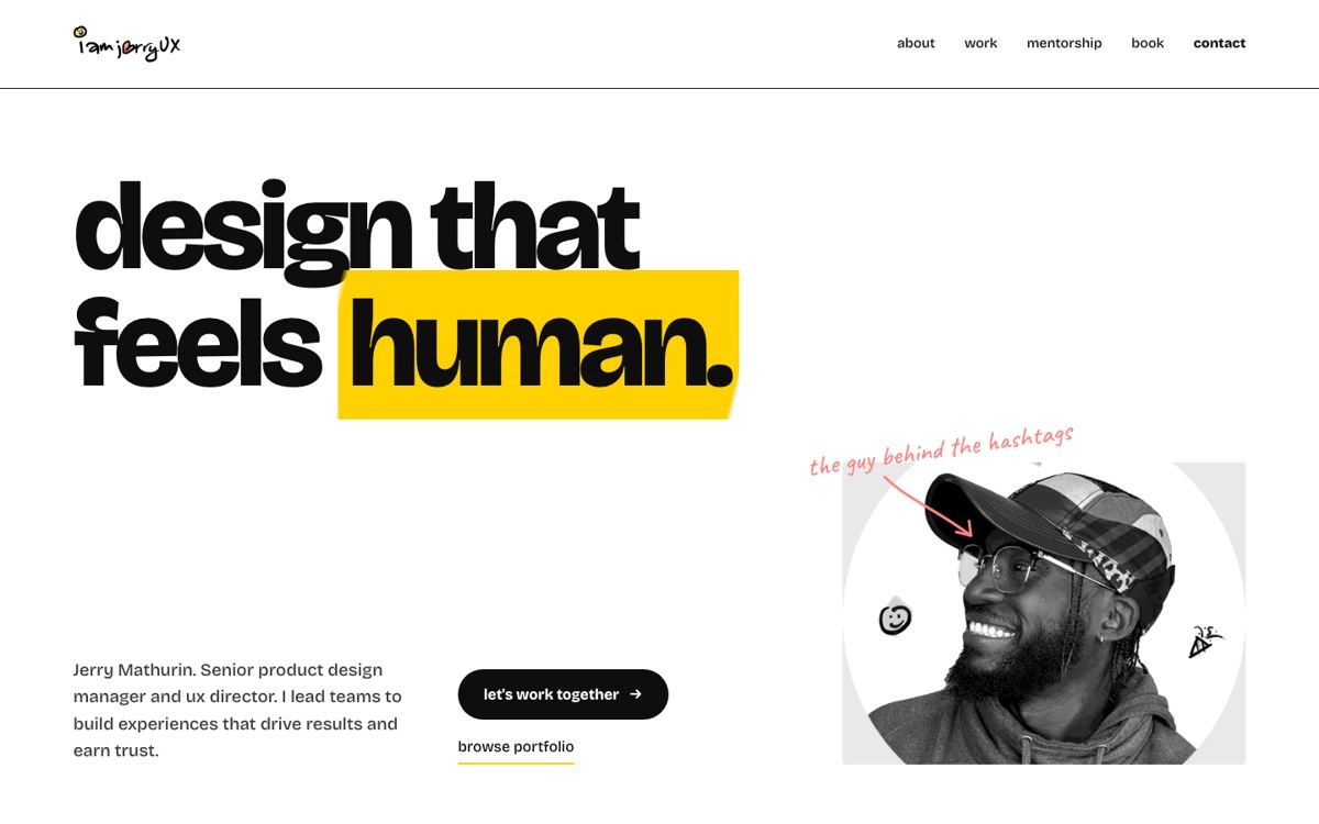
The reference turned out to be Notion: characters living on the edges of real product components. That reframed the job from "a website" to "an illustration system that a website is built around."
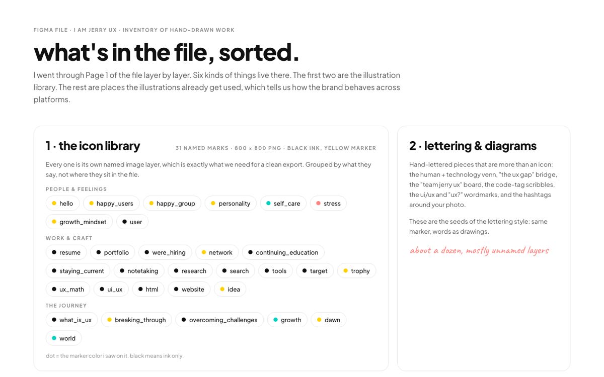
Claude read my Figma file layer by layer: 31 icon marks, a dozen lettering pieces, five carousel series, a hundred-page book and a hundred photo cutouts. Every one was exported and sorted.
Traced from my drawing, rebuilt as geometry, given a pressure stroke, then given thin endpoints and small real hats. Each round was my critique and Claude's redraw.
 round 1
 round 2
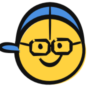 round 3
 round 4
The rule that fixed it: every line in every illustration uses the same pressure stroke, thin in, one swell, thin out, at one weight. Written down in a file so it cannot drift.
Each mark was rebuilt on that rule and approved one at a time. Approved marks are frozen as files that later rounds are not allowed to touch.
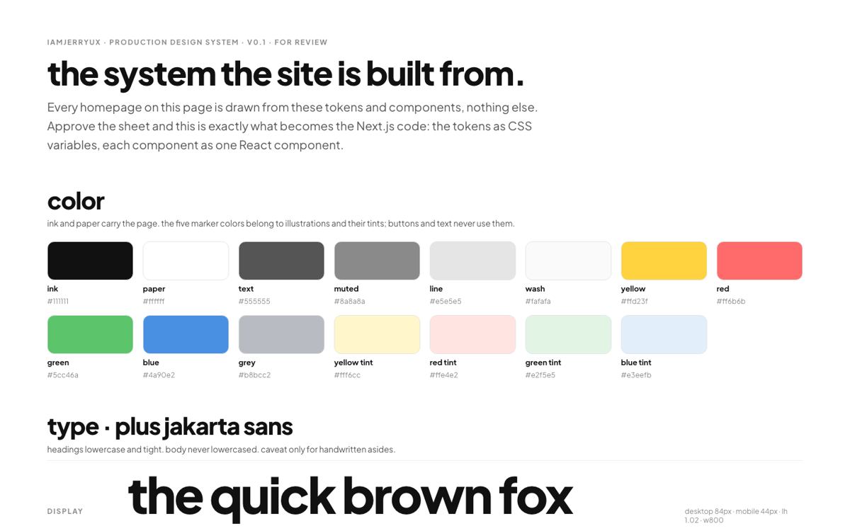
Tokens and components defined once, in one place, and used to draw every page mockup before any code existed.
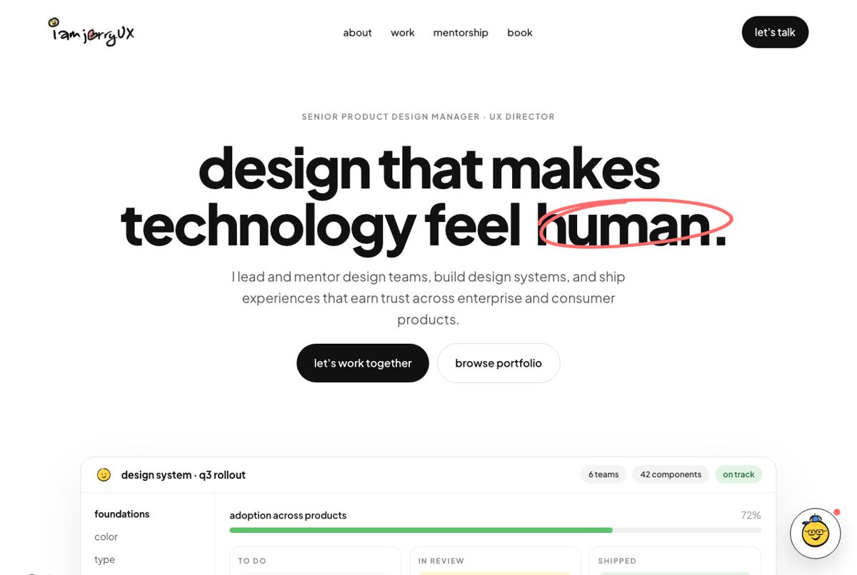
A Next.js site generated from those same tokens and illustrations, so the design and the code cannot drift apart. Every drawing on this page is a component.
The same five pages as they were. Scroll sideways, then compare with the row below.



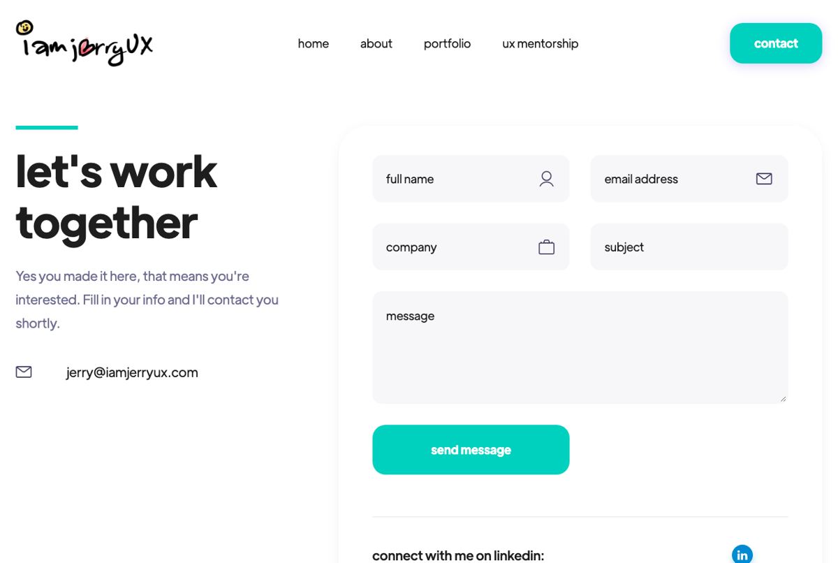
White page, black type, and the drawings carrying every bit of colour and motion.
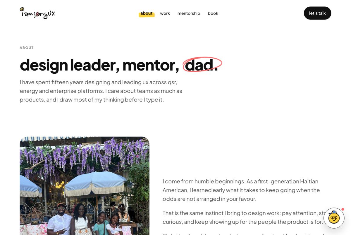
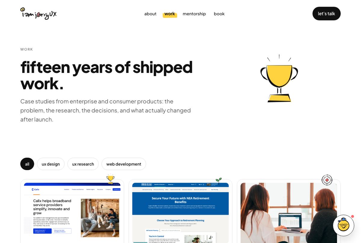

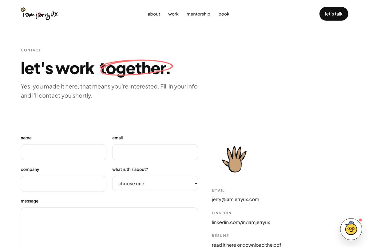
Round three still looked like a machine drew it. The fix was not a better prompt, it was a written rule: every stroke enters thin, swells once or twice, and leaves thin, at one weight everywhere.
Once that lived in a file instead of in a conversation, everything after it matched. That is the part worth stealing.
The whole project ran in one long session: reading Figma, tracing, drawing, critiquing, then writing the production code.
Where the original drawings live. Nothing was redrawn from memory; everything traces back to a file.
Tokens as CSS variables, every illustration as a component, generated from the same source as the design.
Bring taste and a body of work. The model can draw, trace, refactor and remember, but it cannot tell you when something is finished. That judgement is the job, and it is still yours.
Critique like you would with a junior designer: specific, visual, one thing at a time. "Make it more professional" got me nowhere. "Thin the endpoints of every stroke" changed the entire system.
Lock what you approve. Anything unfrozen will drift.