popeyes · 2025 · ux design

menu simplification

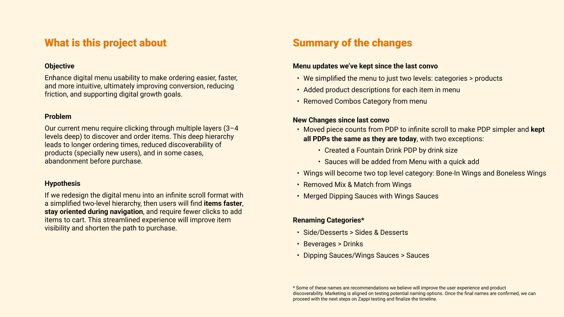
My team cut the core menu from 44 items to 12 and rebuilt it as two simple levels: categories, then products.

the two-minute version

the problem

Guests went four levels deep to reach a product, and the four core categories held 44 items.
what i did

My team tested the structure with 60 people, then two layouts with 24, and rebuilt the menu in two levels.

the result

The core menu went from 44 items to 12, a 72% cut, in one structure across five breakpoints.

my role
led, with two senior designers on my team
platform
App and web
deliverables
Heuristic review, Card sort and tree test, Usability tests, Information architecture, Responsive menu
fewer core menu items (44 to 12)
72%
people in the card sort and tree test
60
people in the usability test
24

the problem

  1. four levels deep to order chicken

    Guests had to go four levels deep to reach a product, and the four core categories held 44 items.

    Pre-read slide with objective, problem and hypothesis sections.
    The problem, the hypothesis and every change, on one page for stakeholders.

the process

  1. test the structure before the screens

    A heuristic review, then a card sort and tree test with 60 participants.
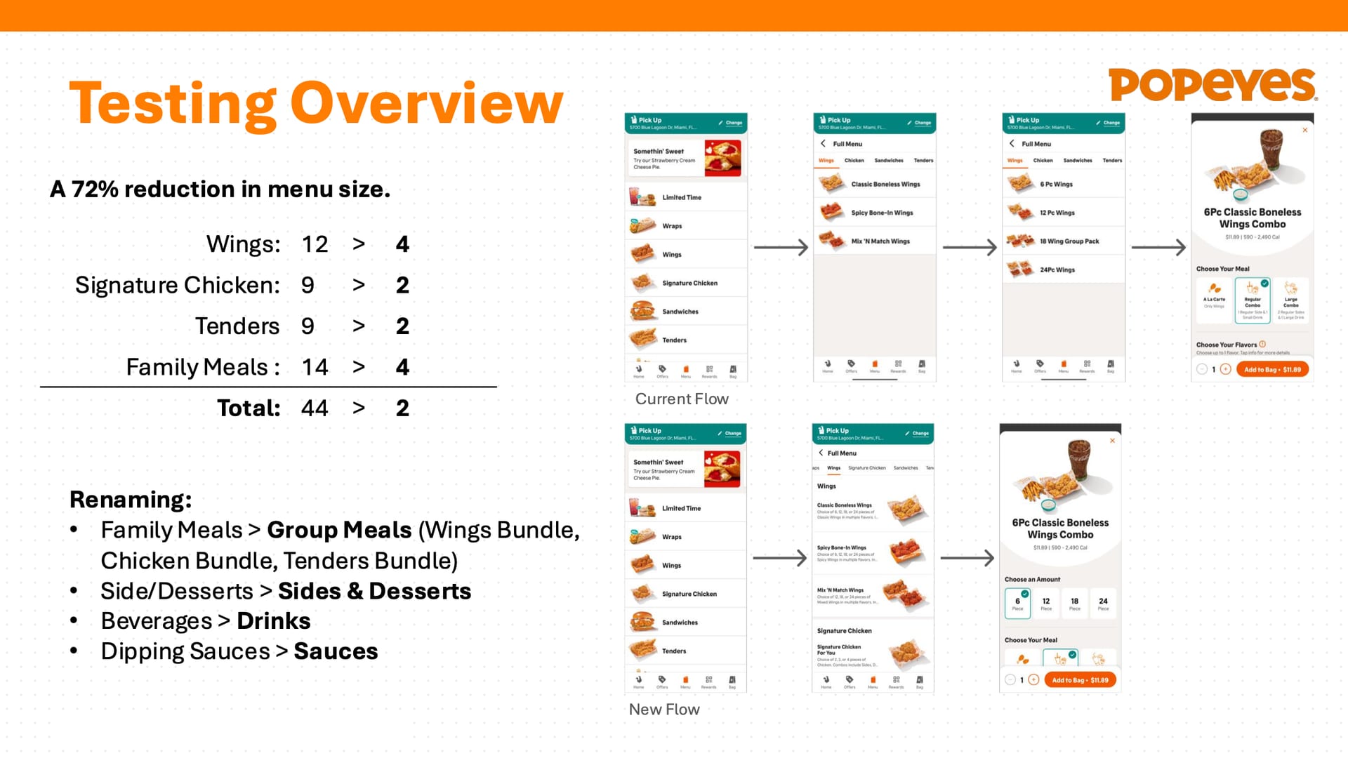
    Slide with item counts per category and current vs. new flow screens.
    Cutting the four core categories from 44 items to 12.
  2. big cards or infinite scroll

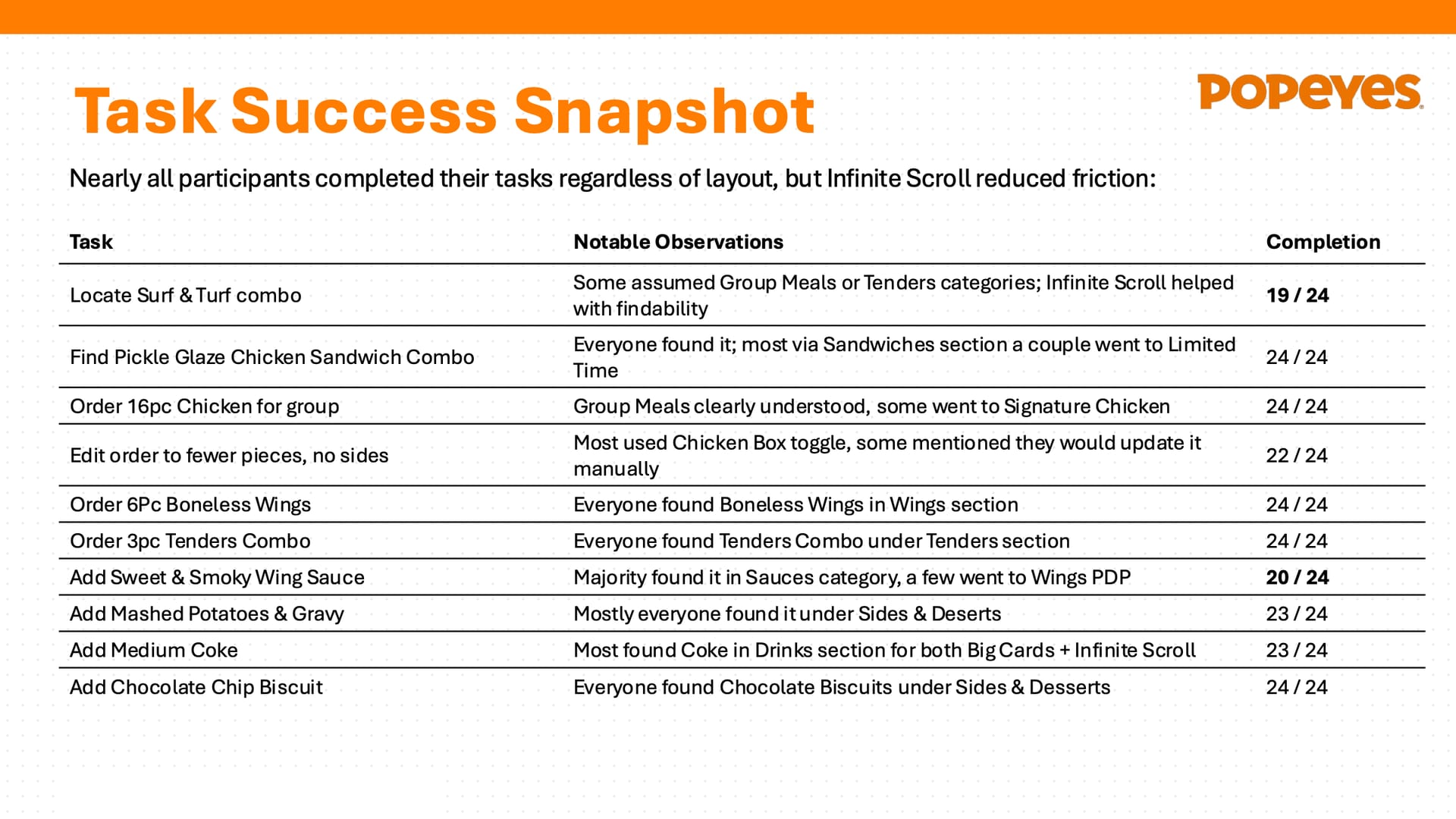
    Two layouts head to head with 24 participants in four cohorts. Nearly everyone completed every task, and infinite scroll reduced friction.
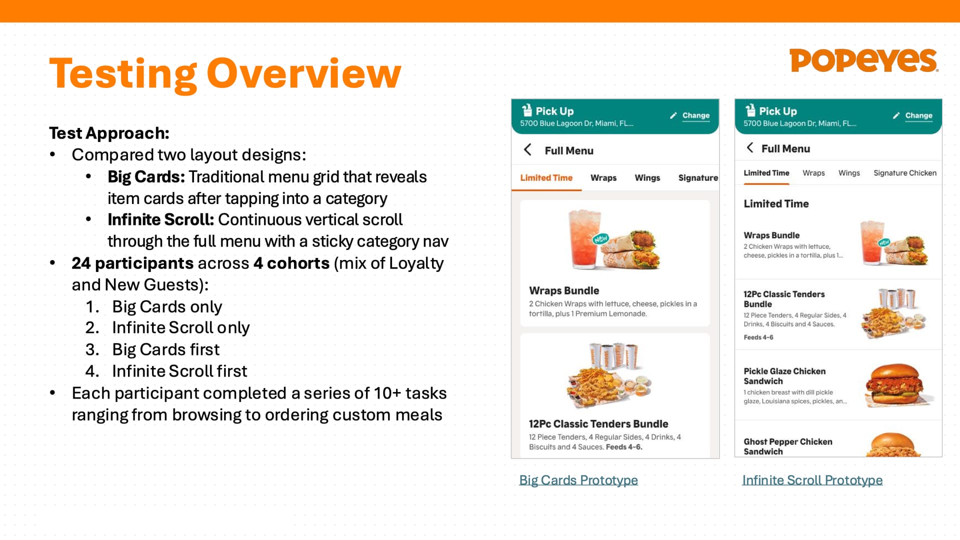
    Slide with test approach and two menu prototypes.
    24 participants, four cohorts, two layouts.

the solution

  1. two levels: categories, then products

    Infinite scroll as the default. Tabs scroll the page, so guests never lose their place.
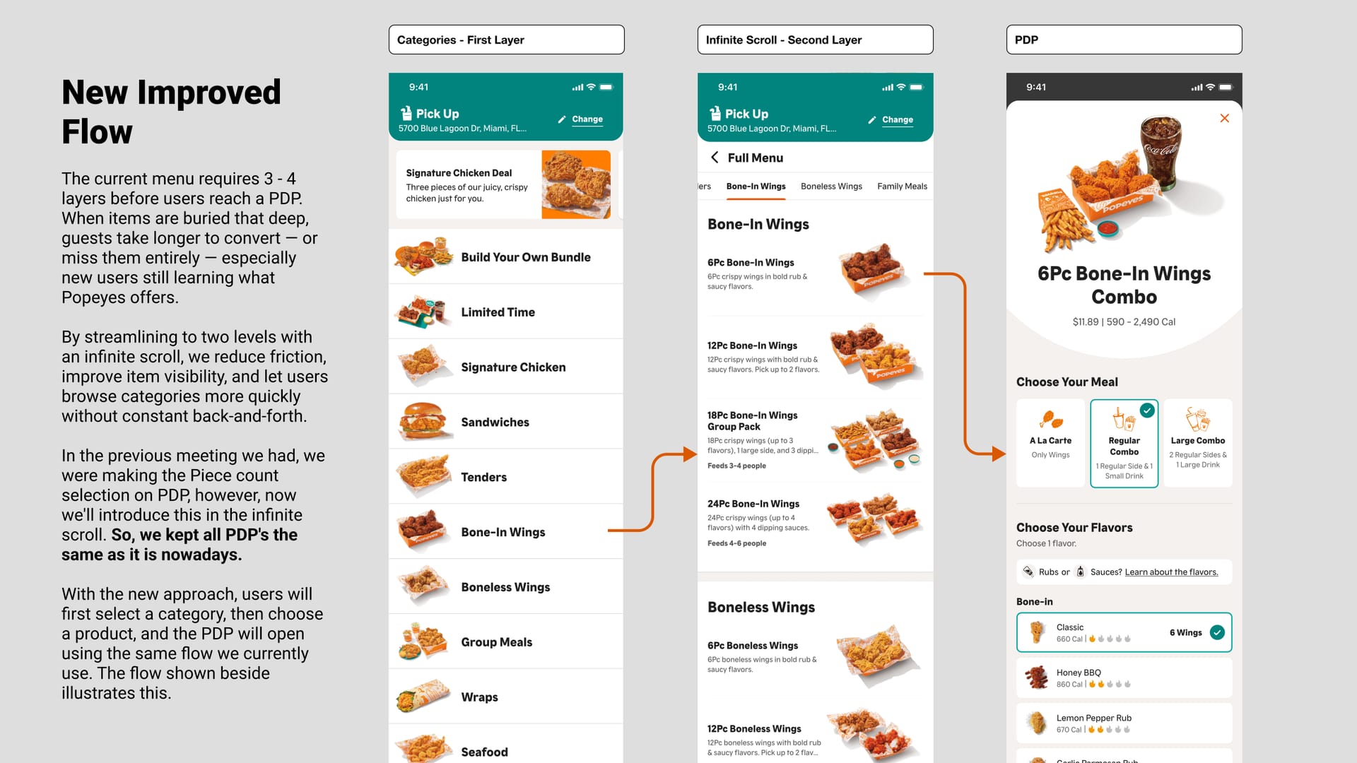
    Three connected phone screens with arrows.
    Select a category, scroll products, open the same PDP.
  2. sauces in one tap

    Sauces add with one tap, straight from the menu.
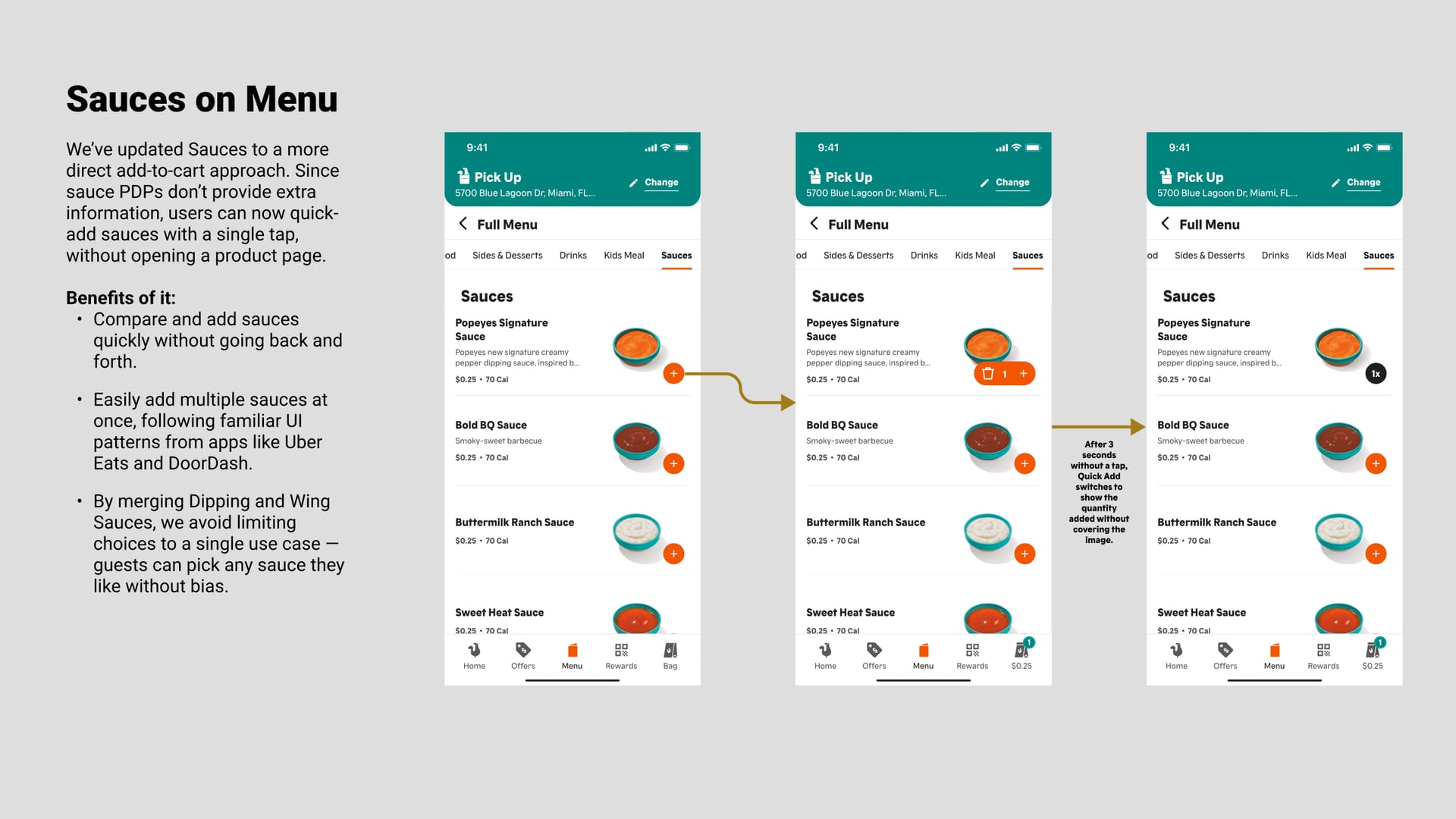
    Three phone screens showing a sauce quick-add interaction.
    Sauces add with one tap, straight from the menu.

impact & next steps

  1. 44 items became 12

    The four core categories went from 44 items to 12, a 72% cut, in one structure across five breakpoints, web and app.
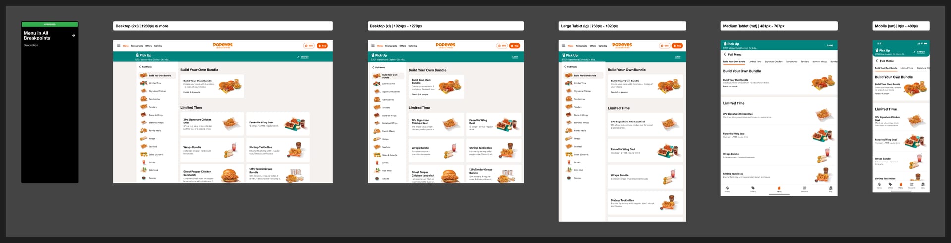
    The same menu at five screen widths.
    One information architecture across five breakpoints, web and app.
more from the project

Scroll sideways for the screens that didn’t fit the story.
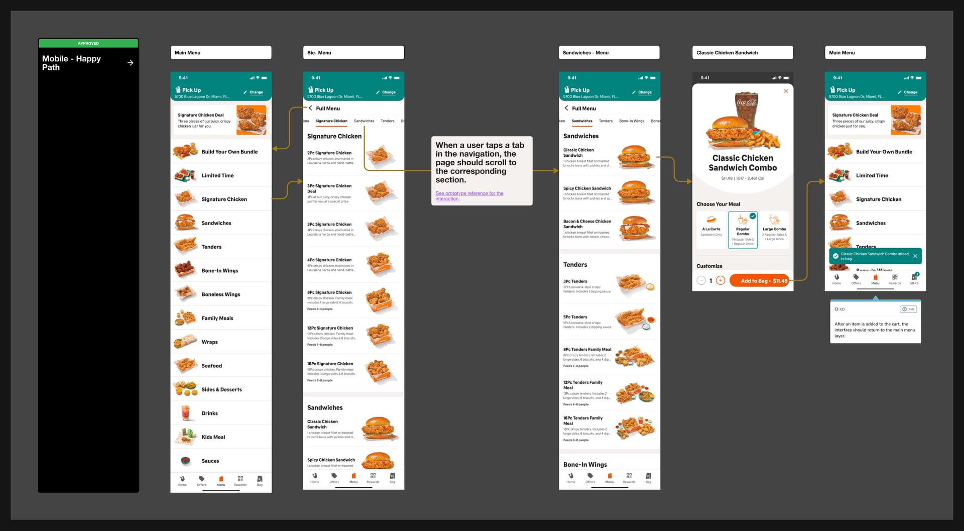
Connected mobile screens from menu to product page and back.
Tabs scroll the page, so guests never lose their place.
Table of ten tasks with completion out of 24.
Nearly everyone completed every task; infinite scroll reduced friction.
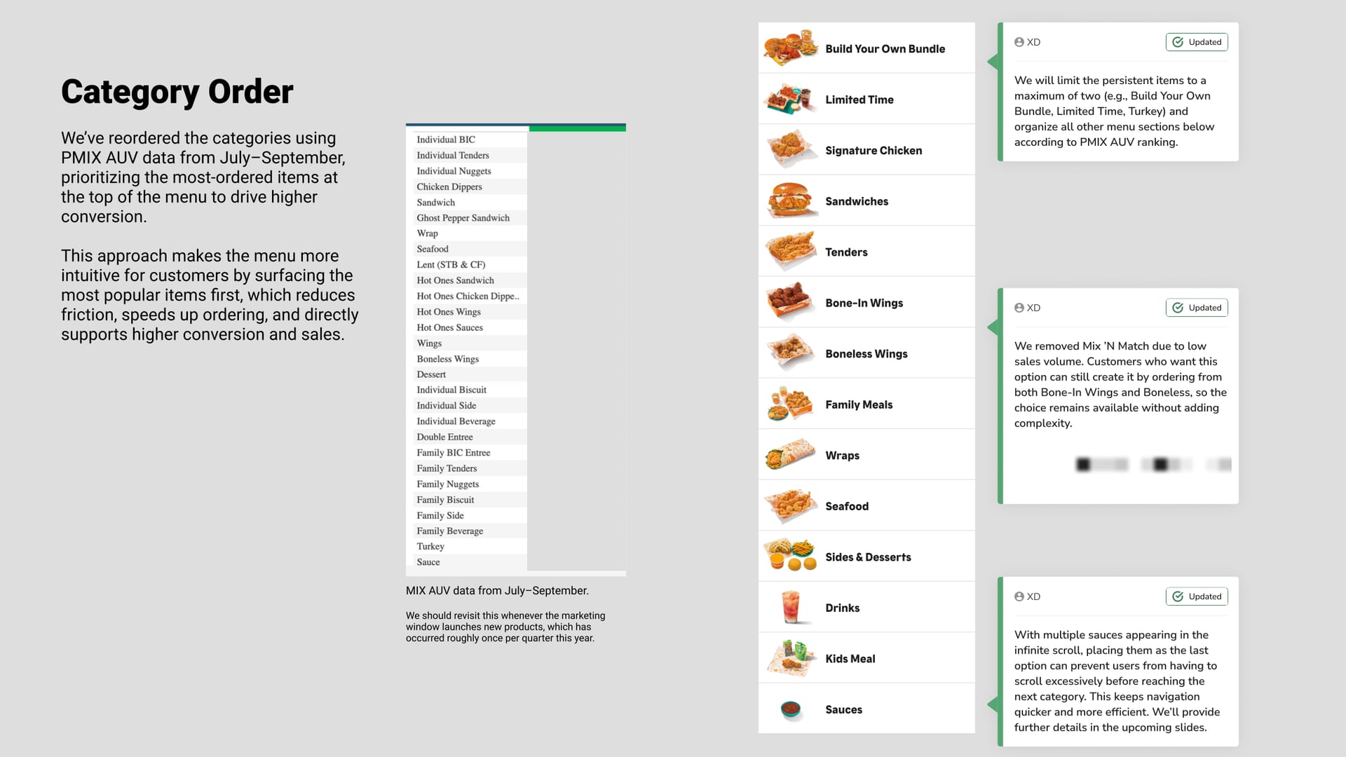
Category list with three annotation cards; data table values removed.
Ordering categories by what guests buy most.
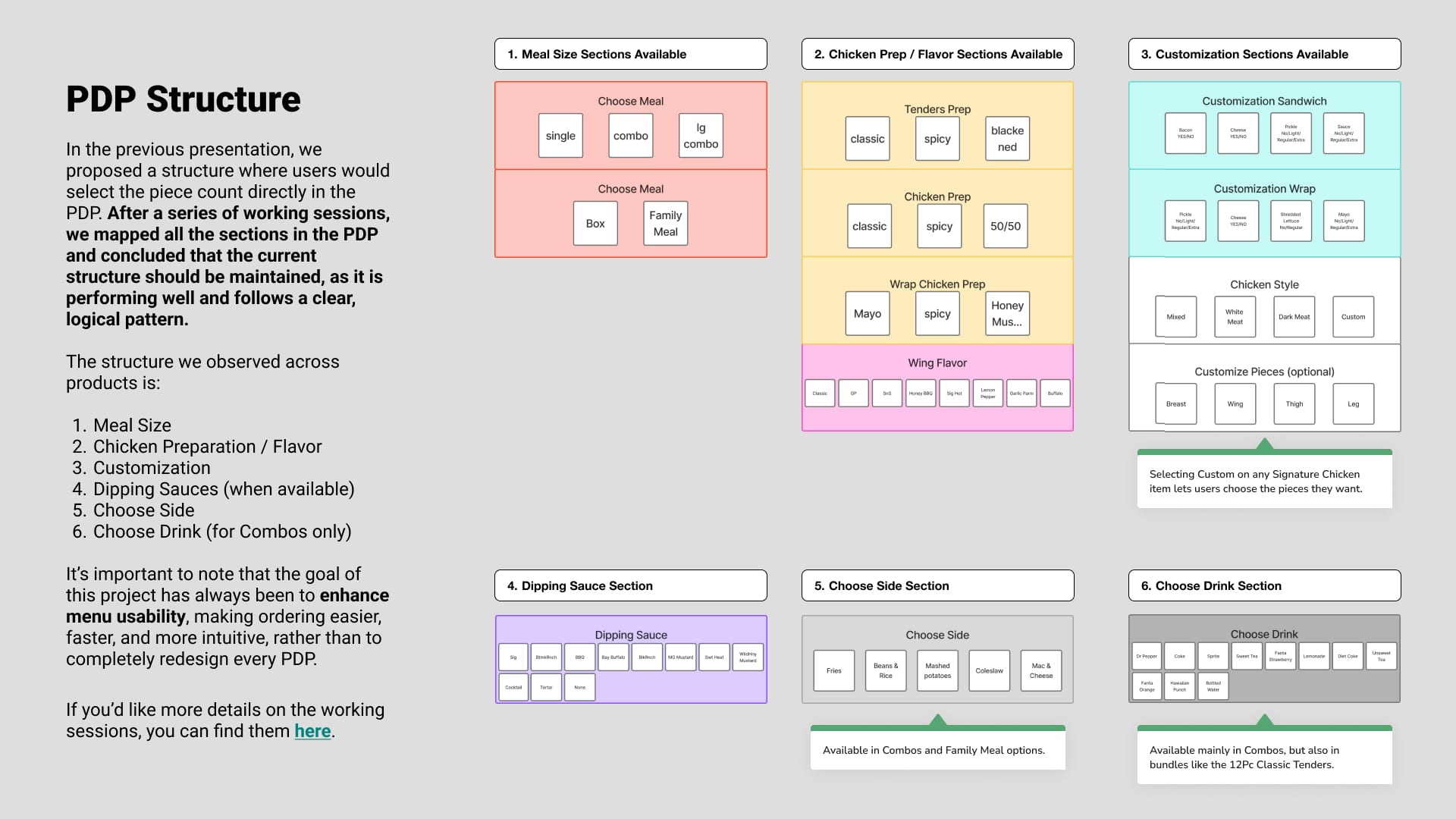
Color-coded map of product page sections.
We mapped every PDP section and kept what already worked.
next up

build your own bundle

A step-by-step builder for group orders. It launched nationally, then moved to the kiosk.

or see all 20 projects
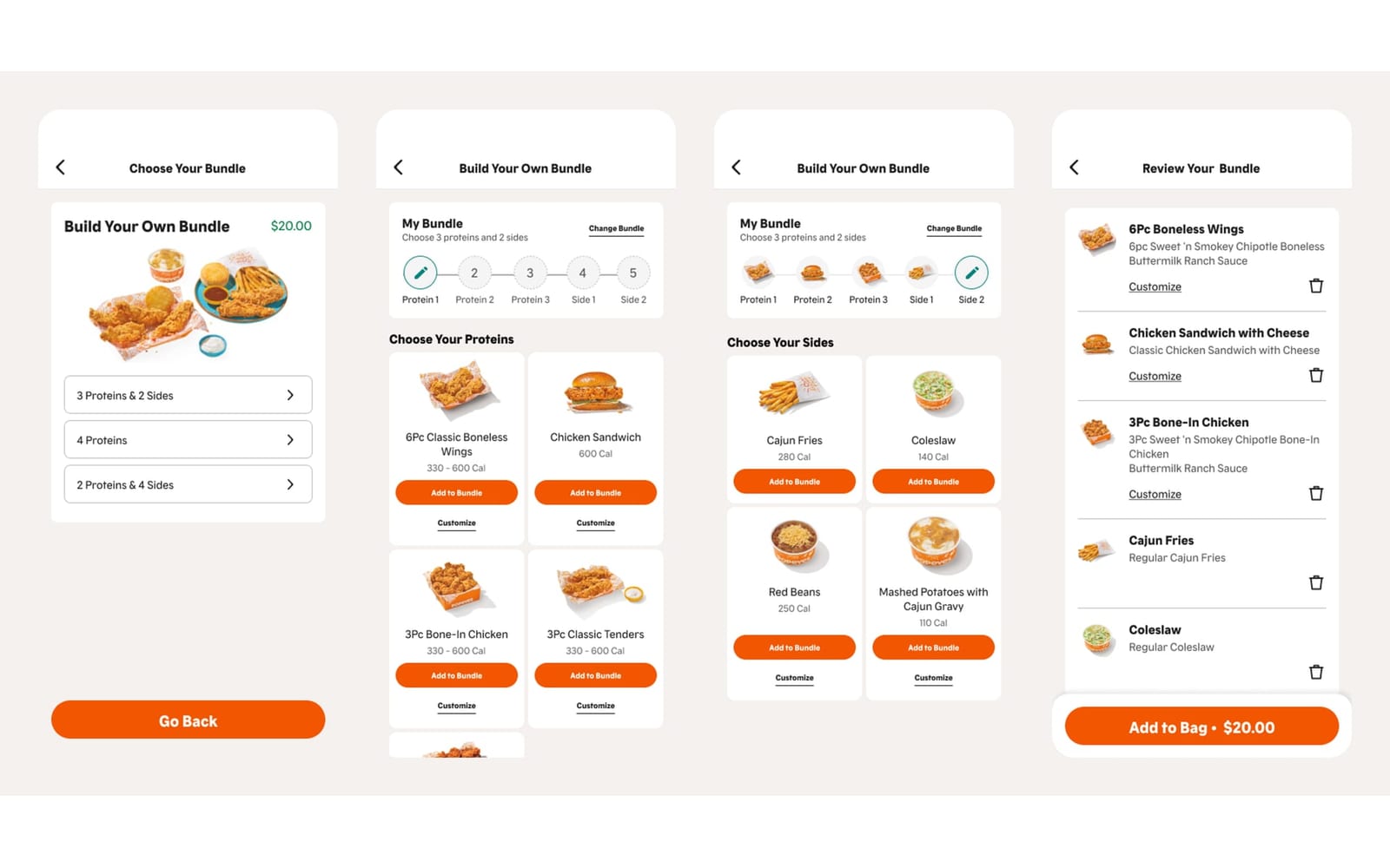
ux design · popeyes

build your own bundle

ready to make something awesome together?