popeyes · 2026 · ux design

cross-channel upsell strategy

One shared language for upselling across the app, kiosk, voice AI, POS and menu boards, tested through research and live experiments.

the two-minute version

the problem

Five channels each ran their own upsells, with no shared vocabulary, measurement or strategy.

what i did

I audited every surface, benchmarked 9 brands and built one framework: when to ask, what to offer, how to rank.

the result

+18% upsell purchases in a live A/B test, and a taxonomy leadership adopted company-wide.

my role
strategy lead and designer
platform
App, kiosk, voice AI drive-thru, POS, menu boards
deliverables
Upsell audit, Competitive benchmark, Upsell taxonomy, Surface map, Card component, Leadership readouts
upsell purchases in a live A/B test
+18%
qsr brands benchmarked
9
participants said hidden prices hurt trust
38 of 39

the problem

  1. every channel spoke a different upsell language

    Each channel ran its own upsells, with no shared vocabulary, no shared measurement and no strategy. Many app users never scrolled far enough to see the first upsell.
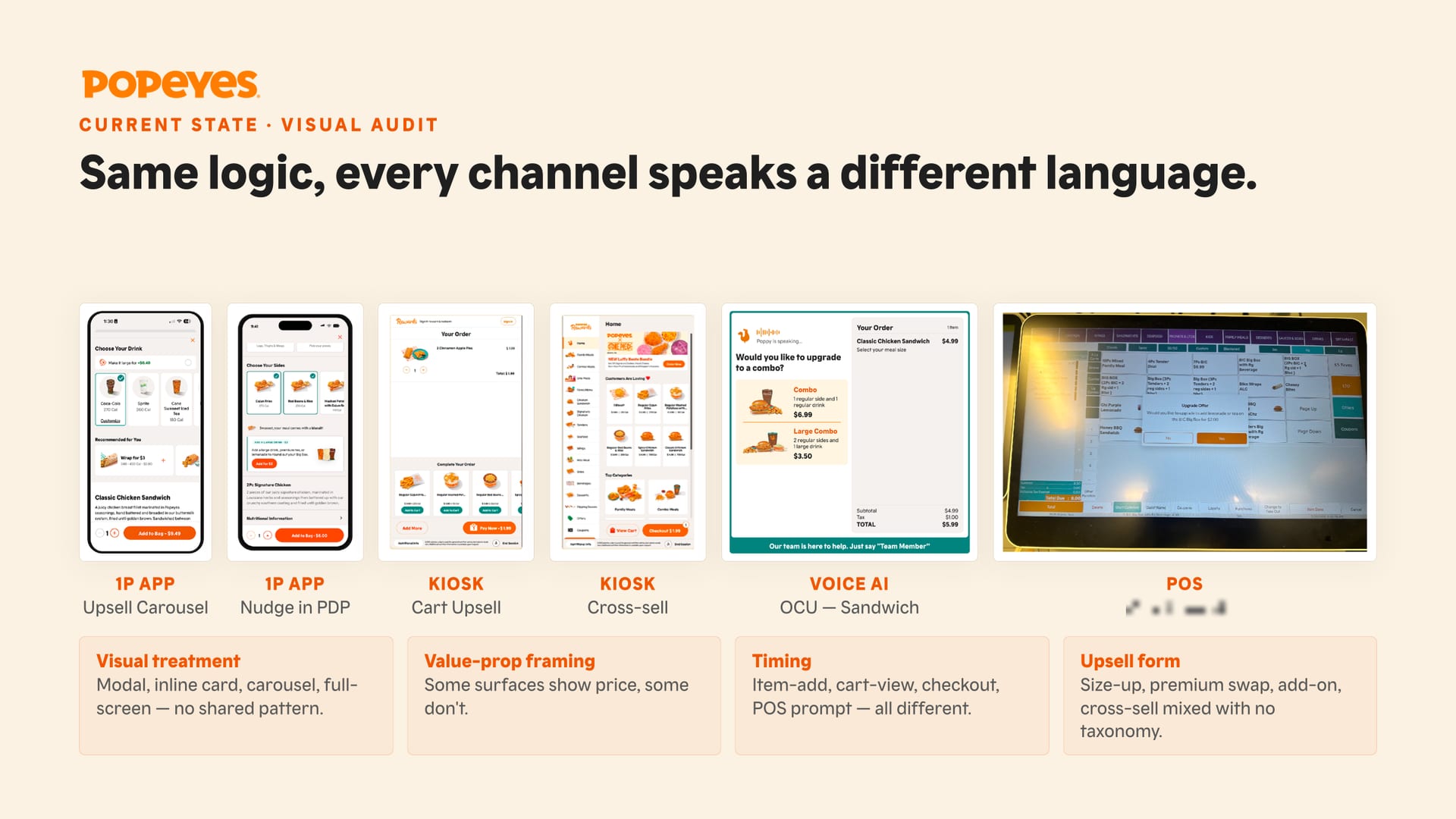
    Six upsell screens from four channels with four labeled problem areas below.
    Every channel spoke a different upsell language: different treatment, framing, timing and form.

the process

  1. audit everything before designing anything

    I audited every upsell surface in 5 channels and benchmarked 9 QSR brands across 6 funnel stages. What I found: everyone has solved the front of the funnel. The difference is in the cart, checkout and after the order.
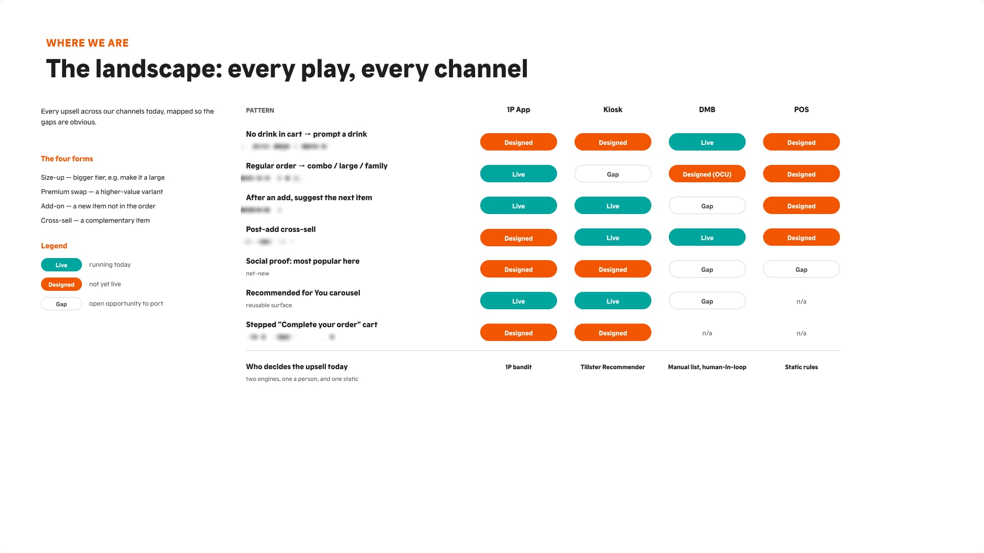
    Matrix of upsell patterns by channel, marked live, designed or gap.
    Auditing every upsell across four channels made the gaps obvious before we designed anything.
  2. three questions: when, what, and in what order

    I built the framework around three questions: when to ask, what to offer, and how to rank.
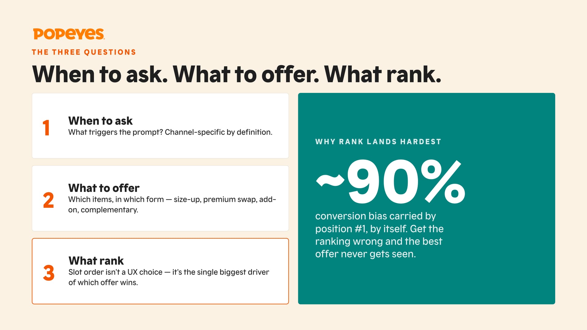
    Slide with three numbered questions and a callout about the first recommendation position.
    Rank, not offer, decides which upsell wins, so slot order became a design decision.

the solution

  1. one model, every channel keeps its own screen

    A 4-type upsell taxonomy (Size Up, Upgrade, Premium Swap, Add-on) with triggers, and a map of 15 surfaces.
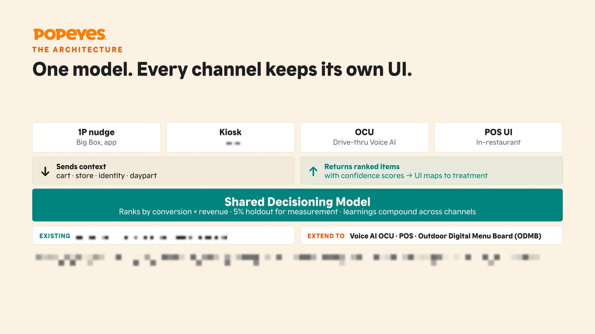
    Diagram with four channel boxes above a shared decisioning model.
    One model ranks the offer; each channel keeps its own UI.
  2. badges that only say true things

    An upsell card component with 84 variants, and social-proof badges grounded in Cialdini. The rules: one badge per card, and every claim has to be true.
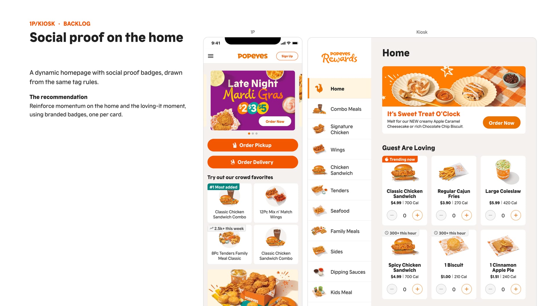
    App and kiosk home screens showing product cards with "Trending now" style badges.
    The same badge language on the app and the kiosk.

impact & next steps

  1. +18% upsell purchases, and a shared language

    In a 2026 live A/B test, my recommended checkout pattern lifted upsell purchases 18%, a statistically significant result, and became the production default.

    Leadership adopted the taxonomy company-wide, across app, kiosk, POS and marketing, and added 3 of my team’s projects to the next roadmap.
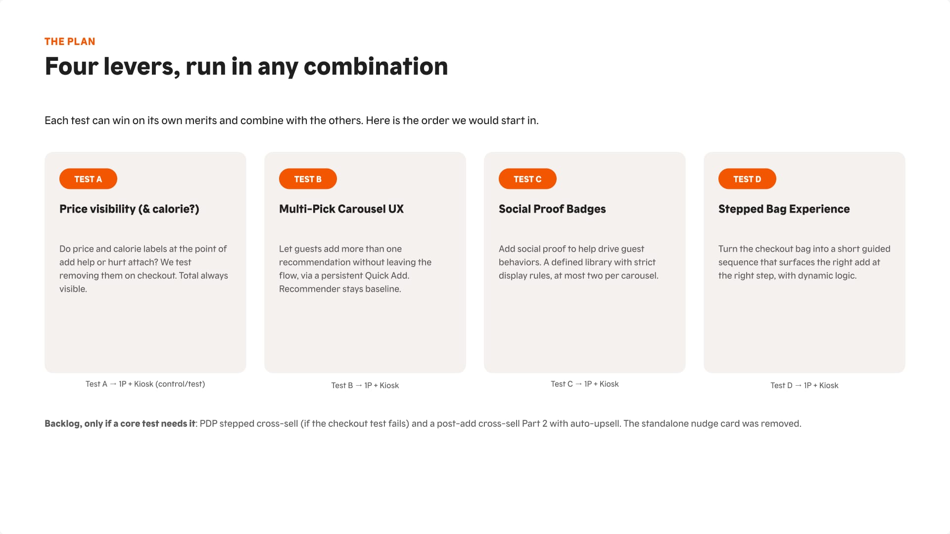
    Slide summarizing four upsell experiments.
    Four independent levers, each able to win alone and combine with the others.

the call i made: keep the prices

Hiding prices looked like an easy way to lower hesitation. Research predicted it would hurt trust instead: 38 of 39 participants said so. The live test confirmed it, and prices stayed.

more from the project

Scroll sideways for the screens that didn’t fit the story.
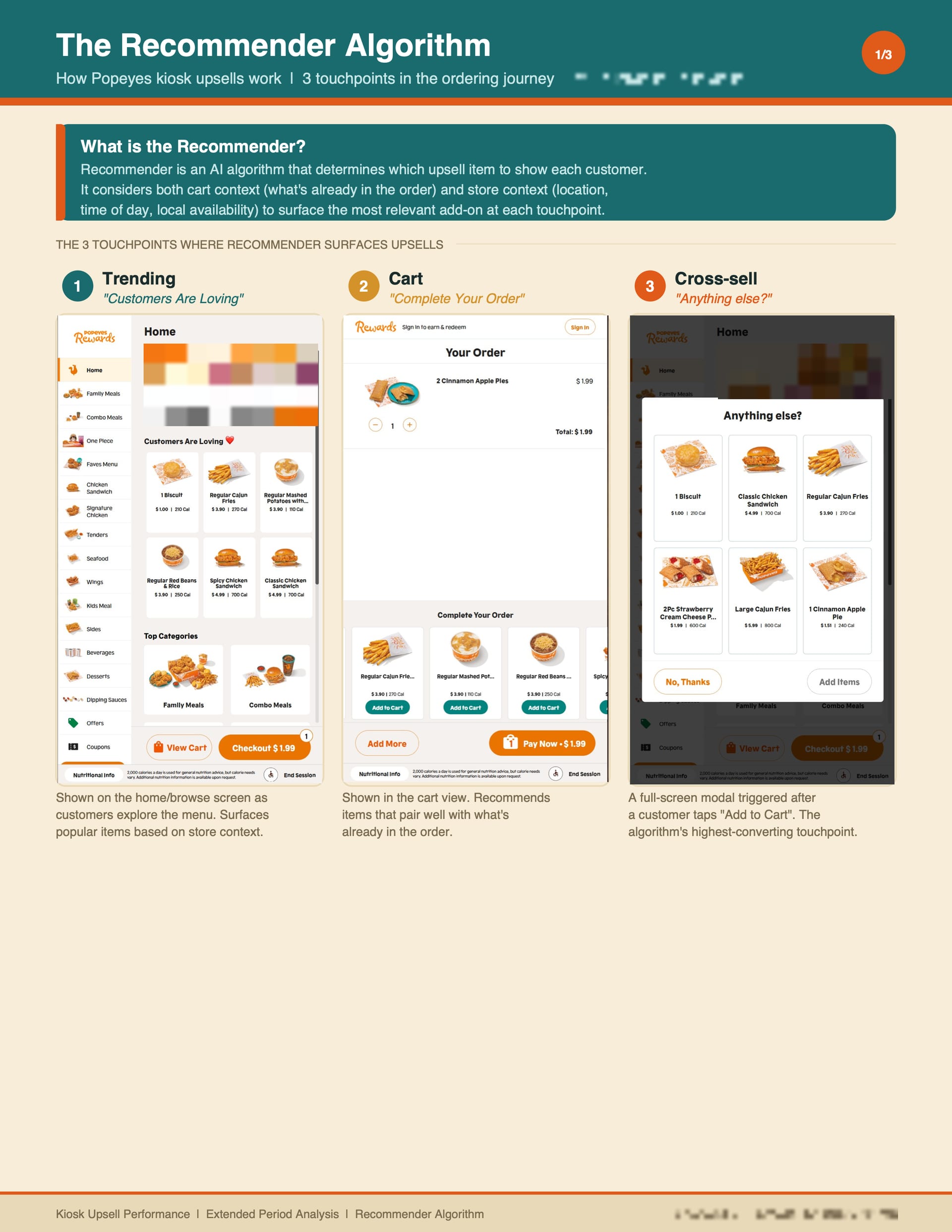
Three kiosk screens labeled Trending, Cart and Cross-sell.
Mapping where the existing kiosk recommender shows up in the order.
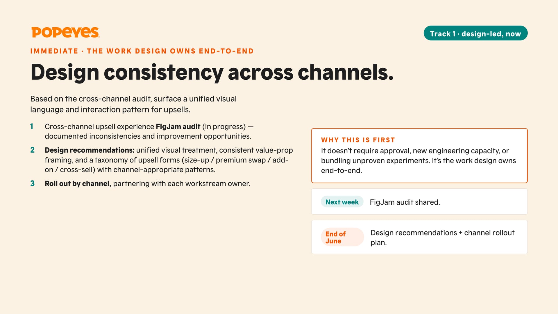
Plan slide listing an audit, design recommendations and channel rollout.
Track one was the work design could own end to end, starting immediately.
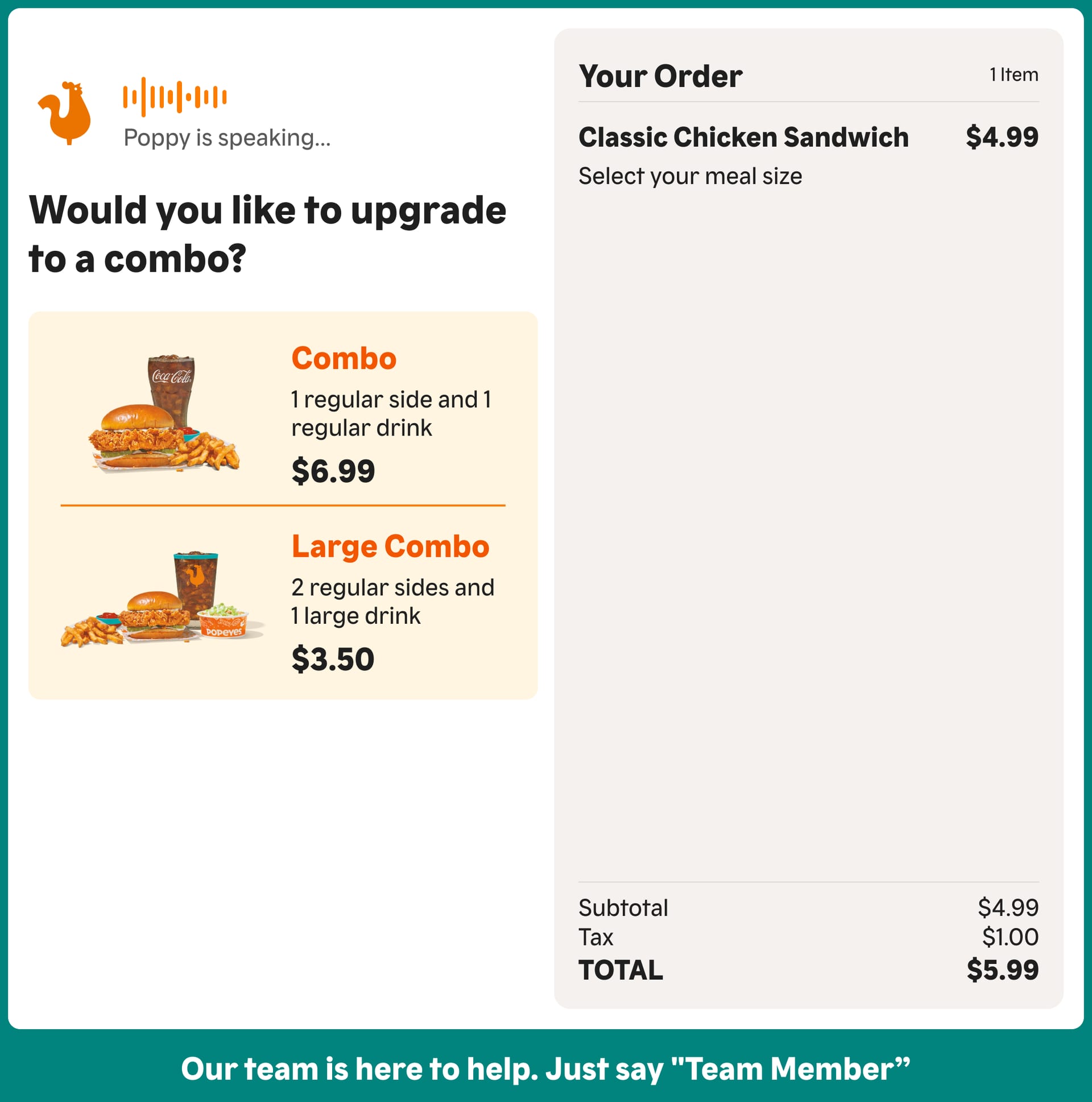
Drive-thru order screen asking "Would you like to upgrade to a combo?" with two options.
Applying the shared pattern on the drive-thru screen.
next up

checkout research: 96 sessions

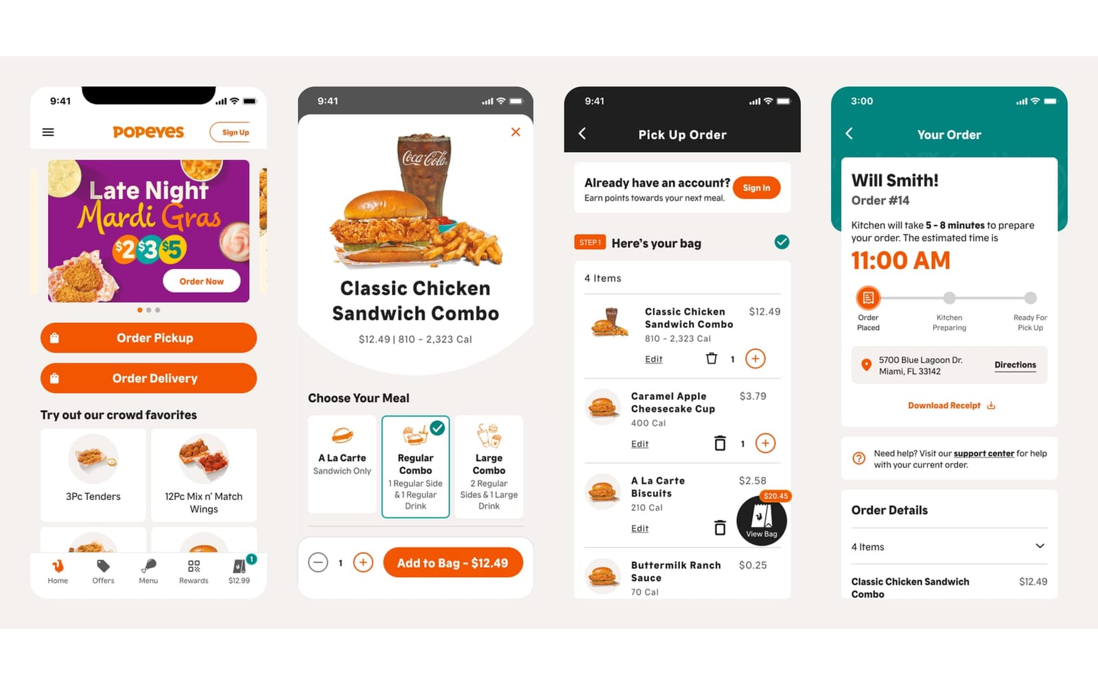
Two rounds of factorial usability testing that shaped a better checkout, plus a code-first research setup that stopped broken prototypes from losing data.

or see all 20 projects
ux research · popeyes

checkout research: 96 sessions

ready to make something awesome together?